Author: J.

  • How to Choose the Right Bed Size for Your Room

    How to Choose the Right Bed Size for Your Room

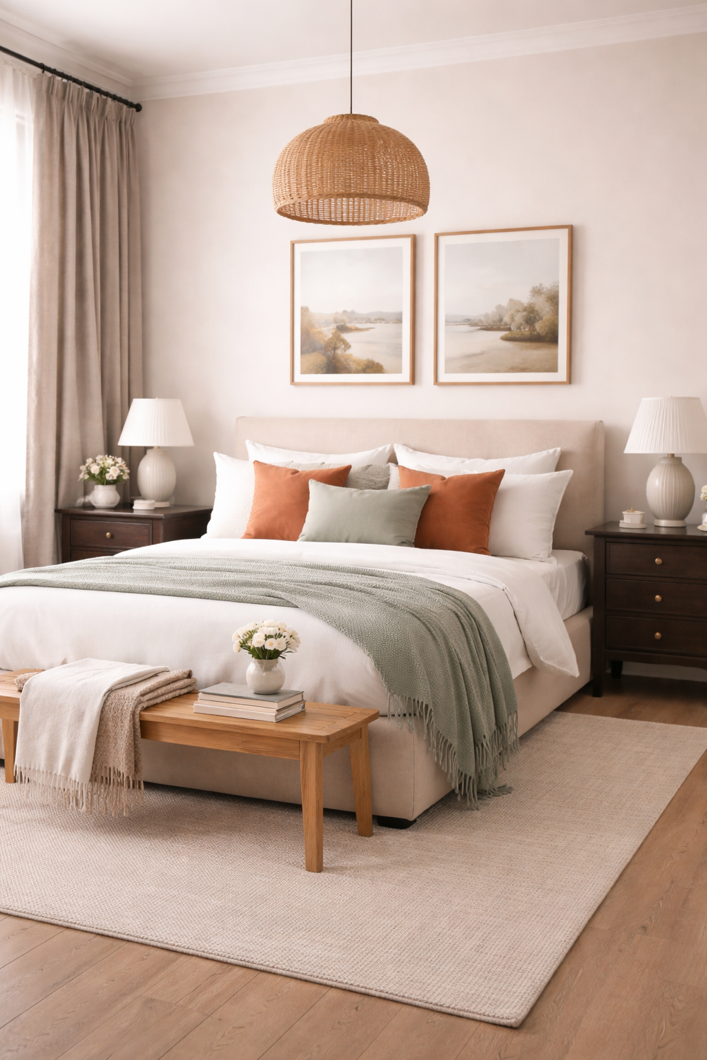
    The right bed does more than provide a place to rest, it defines the rhythm, balance, and visual weight of a bedroom. Selecting the correct size is not simply about comfort; it is about proportion, flow, and the quiet luxury of a space that feels intentionally designed. When scale aligns with layout, the room breathes, and every element—from lighting to textiles—falls into place with ease.

    A well-proportioned bed anchors the room without overwhelming it. Too large, and the space feels restricted, limiting movement and disrupting visual harmony. Too small, and the room can feel incomplete, lacking the presence needed to ground the design. The goal is not to maximize size, but to create balance where the bed supports both the function and the aesthetic of the space.

    A serene, high-end bedroom with a perfectly proportioned queen bed centered on a soft neutral wall, layered linen bedding in warm tones, matching nightstands with sculptural lamps, natural light pouring in through sheer curtains, minimalist luxury aesthetic

    Understanding Scale and Spatial Flow

    Choosing the ideal bed size begins with understanding both the dimensions of the room and the lifestyle it supports. From compact sanctuaries to expansive primary suites, each setting calls for a tailored approach. The following guide highlights how each bed size interacts with space, offering a framework for selecting the right scale with intention.

    Top-down interior layout illustration showing five bed sizes (twin, full, queen, king, california king) proportionally placed within rooms of increasing size, clean minimal design, soft neutral color palette, labeled dimensions, architectural diagram style

    Twin Bed

    A Twin bed is best suited for smaller rooms, guest spaces, or multifunctional layouts where flexibility is essential. Its compact footprint allows for additional furniture, making it ideal in rooms that need to serve more than one purpose. When styled thoughtfully, it can still feel elevated and complete rather than minimal.

    Why we love it!
    • Perfectly scaled for compact bedrooms or dual-purpose spaces
    • Leaves room for desks, dressers, or seating areas
    • Maintains an open, breathable layout


    Full Bed

    A Full bed offers a subtle increase in width while maintaining a relatively efficient footprint. It’s a thoughtful choice for single sleepers who want more comfort without compromising space. In mid-sized rooms, it creates a sense of balance; substantial enough to anchor the design, yet restrained enough to preserve flow.

    Why we love it!
    • Ideal for single sleepers seeking additional comfort
    • Enhances proportion without overwhelming the room
    • Works well in medium-sized layouts with layered furniture


    Queen Bed

    The Queen bed remains the most versatile and widely used size for a reason. Its proportions strike a natural balance between comfort and adaptability, making it suitable for most standard bedrooms. It creates a strong focal point while still allowing for nightstands and circulation space on either side.

    Why we love it!
    • Universally flattering for most room dimensions
    • Balances comfort with spatial efficiency
    • Supports symmetrical layouts with ease


    King Bed

    A King bed introduces a sense of expansive comfort and visual weight. Best suited for larger bedrooms, it creates a luxurious, grounded centerpiece that defines the room. However, it requires careful consideration of clearance space to maintain flow and avoid crowding surrounding elements.

    Why we love it!
    • Creates a spacious, hotel-inspired experience
    • Ideal for shared sleeping or added personal space
    • Anchors large rooms with a strong visual presence


    California King Bed

    A California King bed is designed for length, making it particularly well-suited for taller individuals or elongated room layouts. Its proportions subtly shift the visual flow of the space, drawing the eye along the length of the room and enhancing architectural alignment.

    An expansive primary bedroom featuring a king bed with a tall upholstered headboard, oversized nightstands, bench at the foot of the bed, large area rug, high ceilings, dramatic windows, soft natural light

    Why we love it!
    • Perfect for long, narrow bedroom layouts
    • Enhances visual flow in elongated spaces
    • Offers a refined, design-forward silhouette


    Designing Around Your Bed

    Once the bed size is selected, the surrounding layout becomes just as important. A well-designed bedroom allows for at least 24 to 30 inches of clearance around the bed, ensuring ease of movement and maintaining a sense of openness. This spacing is what transforms a room from functional to effortless.

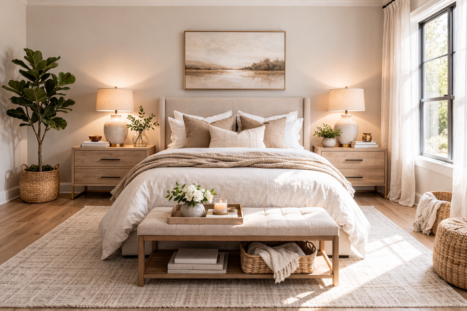
    Nightstands should feel proportional to the bed, not undersized or overcrowded. A Queen or King bed benefits from balanced, evenly spaced nightstands, while smaller beds may allow for more flexibility in placement. The goal is to create symmetry where possible, while still honoring the constraints of the space.

    Additional elements, such as benches, rugs, and lighting, should support the scale of the bed rather than compete with it. A larger bed can handle more substantial layering, while a smaller bed benefits from a lighter, more restrained approach. Every piece should feel intentional, contributing to a cohesive whole.

    Considering Visual Weight and Height

    Beyond width and length, the visual weight of the bed plays a significant role in how the room feels. A low-profile platform bed can make a larger size feel more understated, while an upholstered or statement frame adds presence even in smaller dimensions.

    Ceiling height also influences perception. Lower ceilings often benefit from streamlined silhouettes that maintain an open feel, while taller rooms can support more substantial frames without feeling crowded. This interplay between height and scale is what creates a sense of quiet luxury—where nothing feels forced or out of place.

    Aligning with Lifestyle

    Functionality should always guide the final decision. For those who share their bed, prefer extra space, or value a more indulgent sleeping experience, a Queen or King is often worth the additional footprint. However, in rooms where flexibility, storage, or multi-use functionality is a priority, a smaller bed can create a more balanced and livable environment.

    Storage considerations also come into play. Larger beds can limit space for additional furniture, while smaller beds may allow for dressers, seating, or integrated storage solutions. The right choice supports how the room is used daily, not just how it appears.

    A Thoughtful Approach to Selection

    One of the most effective ways to determine the right bed size is to map it out before committing. Using painter’s tape to outline the dimensions on the floor allows you to experience the layout in real time—walking the space, testing movement, and visualizing how the room will function.

    This simple step often reveals more than measurements alone. It provides clarity on spacing, proportion, and how the bed interacts with the rest of the room—ensuring the final choice feels considered rather than assumed.


    Conclusion

    Selecting the right bed size is ultimately an exercise in balance—between comfort and proportion, presence and openness. When thoughtfully chosen, the bed becomes more than furniture; it becomes the foundation of the room’s design language. By aligning size with layout and intention, the bedroom transforms into a space that feels curated, expansive, and effortlessly composed.


    Frequently Asked Questions

    What size bed is best for a small bedroom?
    A Twin or Full bed is typically best for smaller bedrooms. These sizes maintain a lighter footprint, allowing for better movement and space for additional furniture. If the room is particularly tight, a Twin will feel more open and breathable, while a Full offers slightly more comfort without overwhelming the layout.

    Can I fit a Queen bed in a 10×10 room?
    Yes, a Queen bed can fit in a 10×10 room, but it will be a tighter layout. You may need to scale down surrounding furniture, such as opting for smaller nightstands or skipping a bench at the foot of the bed. Maintaining at least 24 inches of walking space where possible will help the room feel functional rather than cramped.

    How much space should be around a bed?
    Ideally, you should leave 24 to 30 inches of clearance on each side of the bed and at the foot. This allows for comfortable movement and ensures the room doesn’t feel restricted. In smaller spaces, you can reduce this slightly, but anything under 18 inches may start to feel tight.

    Is a King bed too big for a standard bedroom?
    In many standard bedrooms, a King bed can feel oversized unless the room is at least 12×12 feet or larger. While it may physically fit, it can limit space for nightstands and walking clearance, making the room feel crowded. A Queen bed is often a more balanced choice for average-sized rooms.

    What’s the difference between a King and a California King?
    A standard King bed is wider, while a California King is longer. King beds are ideal for maximizing width and shared sleeping space, while California Kings work better in longer, narrower rooms or for taller individuals who need extra legroom.

    Should I size up my bed for comfort?
    Not always. While a larger bed offers more sleeping space, it can negatively impact the overall flow and functionality of the room if it’s too large for the layout. It’s better to choose a size that balances comfort with proportion, ensuring the room still feels open and intentional.

    Do bed frames affect how large the bed feels?
    Yes, significantly. A bulky or tall bed frame can make a bed feel much larger and heavier in the room, while a low-profile or minimalist frame can make the same mattress size feel more streamlined. Choosing the right frame can help you visually “scale” the bed to the space.

    What if my bedroom also needs to function as an office or multi-use space?
    In multifunctional rooms, it’s often better to choose a smaller bed size, such as a Twin or Full, to preserve flexibility. This allows space for desks, storage, or seating areas without making the room feel overcrowded. Prioritizing function alongside comfort will create a more livable space overall.

  • How to Choose a Bedroom Color Palette

    How to Choose a Bedroom Color Palette

    A well-designed bedroom begins with a palette that feels intentional, layered, and quietly cohesive. The most inviting spaces are never built on a single color alone, instead they unfold through a thoughtful composition of tones that balance softness, contrast, and warmth. A five-color palette offers the ideal structure: one main color to anchor the room, two supporting tones to build depth, a refined accent for visual interest, and a grounding natural material to bring everything into harmony.

    This approach transforms color from a simple choice into a curated experience; one that feels both elevated and deeply personal.

    Creating a palette in this way allows every element in the room to feel connected. From walls and textiles to furniture and finishes, each color plays a distinct role, ensuring the space feels layered rather than overwhelming. The result is a bedroom that feels calm, complete, and visually considered.


    Main Color | The Foundation Hue

    A serene bedroom featuring a five-color palette with soft neutral walls, layered textiles in complementary tones, a subtle accent hue, and warm natural wood furniture creating a cohesive and calming space.

    The main color sets the emotional tone of the bedroom. It typically covers the largest surface area like walls, large upholstery pieces, or bedding and acts as the visual anchor for the entire palette.

    A successful main color is neither too bold nor too flat. Soft neutrals such as warm ivory, muted sage, or dusty blue create a restful foundation, while deeper tones like charcoal or mocha can introduce a cocooning effect when balanced correctly. The key is choosing a shade that feels expansive yet grounded, allowing the other colors to layer seamlessly on top.

    Why we love it!

    • Establishes the overall mood and atmosphere of the space
    • Provides a cohesive backdrop for layering additional tones
    • Creates visual calm when used across large surfaces

    Supporting Color One | The Soft Contrast

    Neutral upholstered bed in a soft warm beige fabric acting as the main color foundation within a calming bedroom setting.

    The first supporting color should gently contrast the main hue while maintaining harmony. This tone often appears in secondary textiles and helps prevent the palette from feeling one-dimensional.

    If the main color is cool, this supporting tone can introduce subtle warmth, and vice versa. For example, pairing a soft gray main color with a warm taupe supporting tone creates a nuanced interplay that feels effortless rather than stark.

    Why we love it!

    • Adds dimension without disrupting the overall calm
    • Bridges tonal gaps between other palette elements
    • Enhances visual interest in soft, understated ways

    Supporting Color Two | The Depth Builder

    Linen curtains in a muted taupe tone adding soft contrast and texture to a light-filled bedroom.

    The second supporting color introduces depth and structure. This is often a slightly richer or darker tone that grounds the lighter hues in the room. It can appear in furniture finishes, layered bedding, or larger décor pieces.

    This color should feel like a natural extension of the palette and never competing, but quietly reinforcing it. For example, a palette built around soft beige and cream might incorporate a deep caramel or espresso tone to anchor the space.

    Why we love it!

    • Grounds the palette with subtle richness
    • Prevents the room from feeling overly light or washed out
    • Adds visual weight in a refined, balanced way

    Accent Color | The Statement Detail

    Dark wood nightstand in a rich espresso finish introducing depth and grounding to a neutral bedroom palette.

    The accent color is where personality enters the space. Used sparingly, this tone draws the eye and creates moments of visual intrigue. It may appear in decorative pillows, artwork, or a single statement piece.

    The most effective accent colors are slightly unexpected yet still connected to the palette. A muted terracotta in a neutral room or a deep navy in a soft tonal scheme can elevate the entire design without overwhelming it.

    Restraint is essential and this color should feel intentional, not dominant.

    Why we love it!

    • Introduces contrast and visual energy
    • Highlights key design moments within the room
    • Allows for seasonal or stylistic updates with minimal effort

    Natural Material Shade | The Organic Anchor

    Decorative throw pillows in a muted terracotta accent tone adding warmth and visual interest to layered bedding.

    No bedroom palette feels complete without the warmth of a natural material. Whether it’s wood, stone, linen, or metal, this element adds texture and authenticity that color alone cannot achieve.

    A light oak finish brings softness and airiness, while darker walnut introduces depth and sophistication. Brushed brass or matte black metal can serve as subtle yet impactful additions, tying the palette together through texture and tone.

    This layer is what makes the room feel lived-in, grounded, and timeless.

    Why we love it!

    • Adds tactile warmth and organic texture
    • Grounds the palette in natural, enduring materials
    • Enhances the overall sense of balance and cohesion

    Bringing the Palette Together

    Light oak bench with natural grain texture bringing organic warmth and balance to the bedroom design.

    The beauty of a five-color palette lies in its balance. Each color serves a purpose, and when layered thoughtfully, they create a space that feels both curated and effortless.

    Start with the main color and build outward, ensuring each additional tone complements rather than competes. Distribute colors evenly throughout the room, echoing them in textiles, finishes, and small details so the palette feels cohesive from every angle.

    The final result is a bedroom that feels serene yet layered, refined yet inviting. A space where every element belongs, and nothing feels out of place.

    When approached with intention, color becomes more than a design choice; it becomes the quiet foundation of a beautifully composed room.


    Frequently Asked Questions

    How do I choose the right main color for my bedroom?
    Start by considering the mood you want to create. Softer tones like warm neutrals, muted greens, or dusty blues tend to feel calming and expansive, while deeper shades like charcoal or mocha create a more intimate, cocooning effect. The main color should feel comfortable across large surfaces and support the overall atmosphere of the room.


    Can I use more than five colors in a bedroom palette?
    You can, but restraint is what creates cohesion. A five-color structure provides enough variation to feel layered without becoming overwhelming. If additional tones are introduced, they should closely relate to the existing palette rather than competing with it.


    What if my room already has furniture in a different color?
    Work with what you have by treating existing pieces as part of your palette. Identify their undertones and build around them using complementary shades. A cohesive room doesn’t require starting from scratch—it requires thoughtful integration.


    How do I keep my palette from feeling flat or boring?
    Focus on contrast through tone and texture rather than adding more colors. Pair lighter and darker shades within the same palette and layer materials like wood, linen, or metal to create depth and visual interest.


    How often should each color appear in the room?
    Repetition is key to cohesion. Each color should appear at least two to three times throughout the space, whether through textiles, furniture, or small accents. This creates a sense of balance and prevents any single element from feeling out of place.


    Can accent colors be changed seasonally?
    Yes! This is one of the most flexible elements of the palette. Because accent colors are used sparingly, they can be easily swapped through pillows, throws, or decorative objects to refresh the space without redesigning the entire room.


    What if I prefer a more minimal look?
    A five-color palette can still feel minimal when the tones are closely related. Choose shades within the same color family and rely on subtle contrast and texture to create variation while maintaining a clean, understated aesthetic.

  • Dark, Moody Interiors: Why This Design Trend Is Everywhere Right Now

    Dark, Moody Interiors: Why This Design Trend Is Everywhere Right Now

    Dark, moody interiors are no longer a niche aesthetic reserved for historic homes or dramatic design enthusiasts. They have become one of the defining movements in contemporary interior design. In a landscape once dominated by bright whites and airy minimalism, the shift toward deeper tones signals something more than a visual preference. It reflects a broader cultural recalibration toward comfort, individuality, and emotional resonance within the home.

    A dark, moody bedroom with deep charcoal walls, a tall upholstered bed in soft neutral fabric, layered linen bedding, warm ambient lighting from bedside lamps, rich wood nightstands, minimal decor

    The Rejection of Overexposed Minimalism

    For years, the design world favored light-filled spaces. White walls, pale woods, and barely-there palettes emphasized openness and simplicity. While undeniably clean and versatile, these interiors often lacked a sense of depth or personality. They photographed well and felt universally appealing, but they did not always translate into spaces that felt grounding or restorative on a daily basis.

    As more people began spending extended time at home, the limitations of this aesthetic became more apparent. Rooms that once felt fresh began to feel stark or unfinished. The desire shifted toward environments that felt more anchored, more layered, and more reflective of how people actually live. Dark interiors offer a counterpoint to this visual overexposure. Rich charcoals, inky blues, forest greens, and warm browns absorb light rather than reflect it. This creates a cocoon-like atmosphere that feels intentional and intimate. The effect is less about making a room look larger and more about making it feel better.

    Split-style interior comparison, one side a bright white minimalist bedroom with light wood and sheer curtains, the other side a dark moody bedroom with deep painted walls, layered textures, warm lighting, same layout mirrored

    Emotional Design and the Rise of Atmosphere

    At the core of this trend is a shift toward emotional design. Home is no longer just a backdrop. It is an active participant in how we decompress, focus, and recharge. Design decisions are increasingly driven by how a space feels, not just how it looks.

    Dark, moody palettes naturally support this philosophy by fostering a sense of calm and retreat. Lower light reflectance values in darker colors soften visual noise and reduce the harshness often associated with bright, high-contrast spaces. This allows the eye to settle, creating a more restful visual experience.

    Textures and materials become more important in this context. Velvet upholstery, matte finishes, aged woods, and brushed metals stand out with greater clarity against a darker backdrop. Lighting becomes more deliberate and layered, favoring warm, diffused sources that create pockets of illumination rather than uniform brightness. Table lamps, sconces, and accent lighting replace overhead dominance, contributing to a more intimate and human-scaled environment.

    The result is a space that feels curated rather than exposed and atmospheric rather than purely functional.

    Cozy dark interior vignette featuring a velvet armchair, warm table lamp glow, stacked books, textured throw blanket, deep green or charcoal walls, soft shadows, intimate lighting

    A Return to Depth, Craft, and Materiality

    Another reason for the rise of moody interiors is the renewed appreciation for craftsmanship and material richness. Dark palettes inherently highlight variation. The grain in wood, the veining in stone, and the subtle sheen of textiles become more pronounced because of the contrast created by deeper tones.

    In lighter spaces, these details can be washed out or overlooked entirely. In darker environments, they are amplified and celebrated. This shift aligns with a broader movement toward investing in fewer, higher-quality pieces rather than filling a space with volume. Furniture and decor are chosen with intention, and each piece is expected to contribute to the overall composition.

    This approach also supports a more timeless aesthetic. Rather than relying on trend-driven decor, moody interiors often incorporate classic materials and silhouettes that age well. The space evolves over time, gaining character rather than losing relevance.

    Close-up of rich interior materials including dark wood grain, black marble with white veining, brushed brass accents, and matte painted wall

    The Influence of Hospitality and Boutique Design

    Much of the appeal can also be traced to hospitality design, particularly boutique hotels, private members’ clubs, and high-end restaurants. These environments have long understood the psychological impact of lighting and color. They use darker palettes to create intimacy, exclusivity, and a sense of escape from the outside world.

    As residential design increasingly borrows from these environments, homeowners are seeking to recreate that same experience. A bedroom becomes more than a place to sleep. It becomes a retreat that encourages rest and disconnection. A living room transforms into a lounge-like space designed for conversation and lingering. Even transitional spaces such as hallways or reading nooks are being treated as opportunities to create mood rather than simply serve function.

    This influence has also elevated expectations around layering. Drapery, rugs, upholstery, and decorative objects are used in combination to build depth and visual interest. The room is experienced gradually rather than all at once.

    Luxury boutique hotel bedroom with dark walls, plush bedding, dramatic lighting, upholstered headboard, layered textiles, elegant decor

    Personalization Over Perfection

    Dark interiors also signal a move away from perfection-driven design. Light, minimal spaces often require constant maintenance to preserve their pristine appearance. Every mark, shadow, or misplaced object becomes visible. This can create an environment that feels more performative than livable.

    Darker palettes are more forgiving and allow homes to feel lived-in without appearing disordered. They embrace variation and imperfection in a way that feels more aligned with real life. This makes them particularly appealing for those who value comfort and authenticity over rigid styling.

    They also offer a stronger canvas for personal expression. Artwork appears more dramatic against a dark wall. Vintage or collected pieces feel more intentional and integrated. Even everyday objects take on a sense of presence when set against a deeper backdrop. The space becomes a reflection of individual taste rather than a replication of a trend.

    The Balance Between Drama and Comfort

    Despite their richness, successful dark interiors are not heavy or oppressive. The key lies in balance. Layering tones within the same color family prevents the space from feeling flat, while incorporating varied textures adds dimension and movement.

    Moments of contrast are equally important. Lighter textiles, reflective surfaces, and metallic accents help break up the depth and prevent the room from feeling enclosed. Natural elements such as wood, stone, and greenery introduce warmth and organic variation, ensuring the space remains inviting.

    Proportion and lighting also play critical roles. A well-designed moody interior considers how light interacts with surfaces throughout the day and adjusts accordingly. The goal is not to eliminate light, but to control and shape it in a way that enhances the overall atmosphere.

    Balanced dark interior with deep painted walls, light neutral bedding, large area rug, brass accents, natural wood furniture

    A Lasting Shift, Not a Passing Trend

    While design trends are often cyclical, the move toward dark, moody interiors appears to be rooted in something more enduring. It reflects a deeper understanding of how environments influence well-being, a renewed appreciation for materiality, and a collective desire for spaces that feel personal and immersive.

    Rather than replacing lighter aesthetics entirely, moody interiors expand the design vocabulary and offer an alternative that prioritizes depth, atmosphere, and emotional connection. Many homes now incorporate a blend of both approaches, using darker tones in specific rooms or zones to create contrast and variety within the overall design.

    In the end, the rise of dark interiors is less about color and more about intention. It represents a shift toward spaces that are designed to be experienced, not just observed. Homes are becoming more than visual statements. They are becoming environments that support how people want to feel, live, and unwind.

  • Bedroom Edit: Gothic Luxe

    Bedroom Edit: Gothic Luxe

    Gothic Luxe is where shadow meets shimmer and heritage silhouettes command the room. Deep mahogany, midnight finishes, sculptural metals, and saturated jewel tones layer together to create a space that feels storied, dramatic, and unapologetically refined. This edit embraces ornate craftsmanship and bold contrast, balancing romantic intensity with curated sophistication.


    Disclaimer: Some of the links in this post are affiliate links. This means that if you click a link and make a purchase, I may earn a small commission at no extra cost to you. I only recommend products I truly love and believe will add value to your home.


    A Gothic luxe bedroom furniture collage featuring a carved mahogany four-poster bed, midnight wood dresser, purple velvet armchair, brass and chrome arched floor lamp, ornate gold mirror, dark botanical artwork, black leopard sculpture, and black patterned flatwoven rug layered.

    From a commanding four-poster bed to sculptural lighting and artful accents, each piece in this collection builds a bedroom that feels immersive and elevated. Rich materials, intricate carving, and moody palettes work in harmony to create a retreat that is both grand and intimate.


    1. Ferret Bed | Noir

    Hand-carved mahogany four-poster bed with variegated disc detailing and towering posts creating architectural drama.

    Ferret Bed establishes the room with architectural drama and heirloom-level craftsmanship. Hand-carved variegated mahogany discs spiral upward along its towering posts, drawing the eye toward the ceiling while grounding the space with rich, enduring presence. As the wood ages, it deepens in tone, amplifying the bed’s historic character and timeless allure.

    Why we love it!

    • Hand-carved mahogany detailing for authentic Gothic drama
    • Towering posts create height and architectural presence
    • Develops a richer patina over time for lasting beauty

    Buy it here!
    >> LINK <<


    2. Spindle Six-Drawer Dresser | Anthropologie

    Midnight-finished acacia veneer six-drawer dresser with sculptural spindle detailing.

    Spindle Six-Drawer Dresser in its midnight finish introduces depth and subtle texture. Crafted from acacia veneer reinforced with engineered hardwood, its spindle detailing adds movement and refinement against darker walls. The silhouette feels classic yet modern, offering substantial storage without sacrificing elegance.

    Why we love it!

    • Rich midnight finish enhances a moody palette
    • Sculptural spindle detailing softens strong lines
    • Six spacious drawers for seamless functionality

    Buy it here!
    >> LINK <<


    3. Opera Purple Armchair | Stefano Giovannoni

    Tufted purple velvet armchair with rolled arms and plush cushioning.

    Opera Purple Armchair envelops the room in plush sophistication. Upholstered in velvety purple with tufted detailing along its rolled arms and backrest, it delivers jewel-toned opulence and tailored comfort. Its sculpted volume creates a glamorous focal point in a bedroom corner or reading nook.

    Why we love it!

    • Saturated velvet upholstery for dramatic contrast
    • Tufted detailing adds classic European influence
    • Generous seat width for luxurious comfort

    Buy it here!
    >> LINK <<


    4. Topia Nightstand | Lulu and Georgia

    Dark-finished wood nightstand with turned legs, single drawer, and open shelf.

    Topia Nightstand balances tradition with refined charm. Turned legs and a classic profile echo heritage design, while the streamlined drawer and open shelf maintain modern practicality. In a dark finish, it layers beautifully beside the bed, adding dimension without overwhelming the space.

    Why we love it!

    • Turned legs introduce sculptural character
    • Drawer and open shelf offer versatile storage
    • Blends British-inspired detailing with California ease

    Buy it here!
    >> LINK <<


    5. Marino Brass and Chrome Metal Floor Lamp | Crate & Barrel

    Sculptural floor lamp with burnished brass geometric base and arched chrome rods supporting a dome shade.

    Marino Brass and Chrome Metal Floor Lamp brings luminous contrast to the moody palette. The burnished brass base anchors the piece while slender chrome rods arch gracefully to support a generous dome shade. Its sculptural silhouette casts a warm, intimate glow that softens deep tones and enhances texture.

    Why we love it!

    • Mixed metals create striking visual contrast
    • Arched silhouette adds sculptural movement
    • Warm overhead glow perfect for reading corners

    Buy it here!
    >> LINK <<


    Related Posts

    Tap an image to see the full post.


    6. Forbidden Fruit Framed Print | Arhaus

    Dark botanical giclee canvas print with crackle finish and distressed black frame accented with antique gold details for Gothic wall décor.

    Forbidden Fruit Framed Print layers in artful intrigue. Rich botanicals emerge from shadow beneath a crackle finish, framed in distressed black wood with antique gold detailing. It adds depth and narrative, reinforcing the room’s romantic and slightly mysterious mood.

    Why we love it!

    • Crackle finish enhances vintage character
    • Antique gold frame details elevate the palette
    • Dark botanical imagery strengthens Gothic ambiance

    Buy it here!
    >> LINK <<


    7. Shyla Floral Animal Mantel Wall Mirror | Anthropologie

    Handmade gold-framed mantel mirror with peacock and floral motifs

    Shyla Floral Animal Mantel Wall Mirror introduces ornate gilded elegance. The handcrafted frame, adorned with peacock and floral motifs, reflects light while amplifying the room’s dramatic layers. Positioned above a dresser or mantel, it becomes both art and architectural detail.

    Why we love it!

    • Gold floral and peacock detailing for opulence
    • Reflective surface brightens darker interiors
    • Functions as both décor and statement piece

    ✨ Check it out here!
    >> LINK <<


    8. Leopardo | Z Gallerie

    Tall black resin leopard statue with sleek finish.

    Leopardo commands attention with regal intensity. Sculpted in sleek black resin at an impressive three-foot height, this statement figure anchors the room with bold, sculptural presence. It introduces a curated touch of drama that feels collected and intentional.

    Why we love it!

    • Striking scale for instant impact
    • Black finish complements moody palettes
    • Adds a gallery-inspired sculptural element

    Buy it here!
    >> LINK <<


    9. Sumaya Soft Black Flatwoven Rug | Ruggable

    Black flatwoven rug featuring mirrored snake and floral motifs in beige and gold tones.

    Sumaya Soft Black Flatwoven Rug grounds the space in intricate pattern and contrast. Mirrored serpents intertwine with florals across a deep charcoal field, accented by warm beiges and golds. The flatwoven construction keeps the room polished while adding visual complexity beneath layered furnishings.

    Why we love it!

    • Bold mirrored snake motif for dramatic flair
    • Deep charcoal base enhances Gothic depth
    • Machine-washable durability for elevated practicality

    Buy it here!
    >> LINK <<


    Gothic Luxe is a study in contrast—dark yet luminous, ornate yet refined. Each piece contributes to a bedroom that feels immersive, artful, and undeniably sophisticated. Explore the full collection to create a space where craftsmanship, texture, and dramatic elegance coexist in perfect harmony.

    Check out the full collection on my LTK >> HERE <<


  • Playroom Edit: Rainbow Pop

    Playroom Edit: Rainbow Pop

    Rainbow Pop is a playful balance of color, curve, and creativity—where joyful hues meet thoughtful design. This edit brings a sense of movement and imagination into the playroom while maintaining a curated, modern foundation that feels intentional rather than chaotic.


    Disclaimer: Some of the links in this post are affiliate links. This means that if you click a link and make a purchase, I may earn a small commission at no extra cost to you. I only recommend products I truly love and believe will add value to your home.


    Main Collage: Curated rainbow playroom featuring arched shelving, colorful rug, modular storage, playful art, and soft seating designed for creative family spaces.

    Each piece in this collection was selected to layer color with purpose, mixing sculptural silhouettes and practical function. Together, they create a play space that feels expressive, organized, and endlessly inspiring.


    1. Daydream 58″ Arched Bookshelf | Wayfair

    Daydream Bookshelf: White arched ripple bookshelf with open shelving adding sculptural storage and playful movement to a modern playroom.

    Daydream 58″ Arched Bookshelf introduces sculptural softness with its oversized arch and ripple detailing, instantly transforming storage into a design feature. The open shelving invites books, toys, and art supplies to become part of the visual story. Its playful form adds personality while anchoring the room with structure.

    Why we love it!

    • Curved silhouette that softens the space
    • Open display encourages creativity
    • Functions as both storage and statement

    Buy it here!
    >> LINK <<


    2. Nessa Nesting Play Table | Birch Lane

    Nessa Play Table: Minimalist kids play table with nesting chairs and built-in cubbies designed for organized creative activities.

    Nessa Nesting Play Table keeps creative moments contained within a clean, modern footprint. The tucked-away chairs and built-in cubbies make organization effortless without interrupting play. Its minimal design allows colorful accessories to shine.

    Why we love it!

    • Chairs nest neatly for visual calm
    • Built-in storage reduces clutter
    • Perfect scale for daily play

    Buy it here!
    >> LINK <<


    3. Nessa Nesting Play Table | Birch Lane

    Nessa Play Table: Minimalist kids play table with nesting chairs and built-in cubbies designed for organized creative activities.

    Nessa Nesting Play Table keeps creative moments contained within a clean, modern footprint. The tucked-away chairs and built-in cubbies make organization effortless without interrupting play. Its minimal design allows colorful accessories to shine.

    Why we love it!

    • Chairs nest neatly for visual calm
    • Built-in storage reduces clutter
    • Perfect scale for daily play

    Buy it here!
    >> LINK <<


    4. Simple Standard Bookcase | Wayfair

    Simple Standard Bookcase: Sage green wooden bookcase offering calm, structured storage for books and toys in a playroom.

    Simple Standard Bookcase grounds the edit with a soothing sage green tone that balances brighter accents. The straightforward design offers dependable storage while blending seamlessly into the room. It brings calm order to a lively environment.

    Why we love it!

    • Soft color that balances bold hues
    • Durable construction for everyday use
    • Clean lines that age gracefully

    Buy it here!
    >> LINK <<


    5. Rainbow Ice Cream Framed Art by Paola Benenati | Pottery Barn Teen

    Rainbow Ice Cream Art: Framed rainbow ice cream artwork adding colorful personality and youthful charm to a playroom wall.

    Rainbow Ice Cream Framed Art adds a dose of whimsy with saturated color and playful subject matter. The artwork injects personality while reinforcing the rainbow theme without overwhelming the walls. It feels youthful yet artful.

    Why we love it!

    • Bright palette energizes the room
    • Framed finish feels polished
    • Celebrates creativity through art

    Buy it here!
    >> LINK <<


    Related Posts

    Tap an image to see the full post.

    Kids Bedroom Edit: Color Drench Blue
    Home Office Edit: Rainbow Dreams
    Bedroom Edit: Rainbow Dreams


    6. Echo Neon Lune Floor Lamp | Urban Outfitters

    Echo Neon Lune Lamp: Color-shifting acrylic floor lamp providing soft ambient lighting with a playful modern glow.

    Echo Neon Lune Floor Lamp introduces atmospheric glow with layered acrylic color. Its lunar-inspired design brings a sense of wonder while providing soft, ambient light. The color-shifting effect enhances the playful mood.

    Why we love it!

    • Adjustable color combinations
    • Sculptural lighting moment
    • Creates cozy evening ambiance

    Buy it here!
    >> LINK <<


    7. Anywhere Beanbag™, Candlewick Rainbow Blush | Pottery Barn Kids

    Anywhere Beanbag: Rainbow blush upholstered beanbag chair offering cozy, movable seating for reading and relaxing.

    Anywhere Beanbag™ offers an inviting spot to read, relax, or daydream. The rainbow blush upholstery adds softness and warmth while keeping the palette light and cheerful. It’s comfort with style built in.

    Why we love it!

    • Lightweight and easy to move
    • Cozy texture for lounging
    • Colorful yet refined finish

    ✨ Check it out here!
    >> LINK <<


    8. Kartell Componibili Round Modular Stacking Units | Joss & Main

    Kartell Componibili: Glossy sky blue round modular storage unit delivering iconic design and hidden organization.

    Kartell Componibili Stacking Units bring iconic design into the playroom with a glossy sky blue finish. The modular form offers hidden storage while adding a retro-modern accent. It’s functional design that feels fun.

    Why we love it!

    • Timeless, recognizable design
    • Compact and versatile storage
    • High-gloss color impact

    Buy it here!
    >> LINK <<


    9. Jelly Dot Brights Rug | Ruggable
    DHV Top Pick

    Jelly Dot Brights Rug: Ivory washable rug with colorful painterly dots creating a vibrant, durable foundation for play.

    Jelly Dot Brights Rug anchors the entire edit with painterly color and playful movement. The ivory base keeps the room feeling open while vibrant dots spark imagination. Its washable design makes it as practical as it is joyful.

    Why we love it!

    • Machine-washable convenience
    • Ties together the rainbow palette
    • Soft foundation for play

    Buy it here!
    >> LINK <<


    Rainbow Pop proves that a playroom can be both expressive and refined. By blending sculptural forms, intentional color, and functional pieces, this edit creates a space that supports creativity while feeling beautifully curated. Explore the collection to bring joyful balance into everyday play.

    Check out the full collection on my LTK >> HERE <<


  • Outdoor Living Edit: Dark Minimalist

    Outdoor Living Edit: Dark Minimalist

    The Dark Minimalist Outdoor Living Edit is defined by contrast, restraint, and intentional design. Deep charcoal tones, sculptural silhouettes, and low-slung forms create an outdoor atmosphere that feels grounded, architectural, and quietly luxurious.


    Disclaimer: Some of the links in this post are affiliate links. This means that if you click a link and make a purchase, I may earn a small commission at no extra cost to you. I only recommend products I truly love and believe will add value to your home.


    Dark minimalist outdoor patio styled with low-profile slate gray sectional, black concrete coffee table, and architectural lighting for a modern exterior lounge.

    This edit curates modern outdoor essentials that balance visual weight with warmth, pairing dark finishes with tactile materials and clean-lined geometry. Each piece is selected to work in harmony, creating an exterior space designed for lingering evenings and effortless outdoor living.


    1. Lubek 82.5″ Outdoor Low Left Sectional – Slate Gray | Article

    Slate gray low outdoor sectional with acacia wood base adding warmth and structure to a modern patio seating area.

    Lubek 82.5″ Outdoor Low Left Sectional – Slate Gray anchors the space with a grounded, modern presence. Its low profile and deep slate cushions invite relaxed lounging, while the solid acacia wood base introduces natural warmth that softens the dark palette. Clean lines keep the look refined and architectural without feeling severe.

    Why we love it!

    • Low-slung silhouette enhances a modern outdoor layout
    • Dark cushions add depth and visual calm
    • Acacia wood base balances warmth and structure

    Buy it here!
    >> LINK <<


    2. Isla Modern Organic Shaped Tripod Low Concrete Coffee Table – Black | Eternity Modern

    Black organic-shaped concrete coffee table serving as a sculptural centerpiece in a minimalist outdoor lounge.

    Isla Modern Organic Shaped Tripod Low Concrete Coffee Table – Black brings sculptural interest to the seating area. Its organic form contrasts beautifully with linear furniture, while the low concrete profile keeps the space casual yet elevated. The black finish reinforces the edit’s minimalist edge.

    Why we love it!

    • Sculptural shape adds artistic contrast
    • Low height maintains a relaxed lounge feel
    • Concrete finish grounds the overall palette

    Buy it here!
    >> LINK <<


    3. EDGE 7-Piece Dining Set | POLYWOOD

    Modern dark wood outdoor dining set with clean lines and slatted table designed for a contemporary exterior dining space.

    EDGE 7-Piece Dining Set introduces crisp geometry to the outdoor dining zone. The clean-lined chairs and slatted tabletop feel modern and purposeful, while the dark finish keeps the look cohesive with the rest of the edit. Its streamlined footprint maintains visual order even in larger layouts.

    Why we love it!

    • Clean silhouettes reinforce modern minimalism
    • Tucked seating keeps the space visually neat
    • Durable construction suits everyday outdoor use

    Buy it here!
    >> LINK <<


    4. Premium 10′ Square Cantilever Outdoor Patio Umbrella – Black | Pottery Barn

    Matte black cantilever patio umbrella providing shade while maintaining a sleek, modern outdoor aesthetic.

    Premium 10′ Square Cantilever Outdoor Patio Umbrella – Black delivers functional shade with a refined presence. The matte black frame feels sleek and architectural, while the cantilever design keeps sightlines open. It adds comfort without disrupting the minimalist aesthetic.

    Why we love it!

    • Matte black finish complements dark palettes
    • Cantilever design keeps layouts uncluttered
    • Adjustable canopy enhances outdoor usability

    Buy it here!
    >> LINK <<


    5. Angular Modern Black Cement Outdoor Planter | CB2

    Angular black cement outdoor planter adding architectural structure and contrast to a minimalist exterior layout.

    Angular Modern Black Cement Outdoor Planter adds architectural structure through sharp geometry and textured cement. Its bold silhouette works beautifully in multiples, framing seating areas or walkways with intention. The matte black finish reinforces the edit’s moody sophistication.

    Why we love it!

    • Geometric form adds visual structure
    • Cement texture introduces subtle dimension
    • Black finish grounds greenery beautifully

    Buy it here!
    >> LINK <<


    Related Posts

    Tap an image to see the full post.


    6. Flindt Garden Long LED Bollard | Lumens
    DHV Top Pick

    Sculptural black outdoor LED bollard light illuminating pathways with soft, glare-free modern lighting.

    Flindt Garden Long LED Bollard serves as the edit’s defining accent, blending lighting and sculpture seamlessly. Its curved form and downward glow create atmospheric illumination while maintaining a clean, modern profile. This piece elevates the exterior with quiet drama and precision.

    Why we love it!

    • Sculptural design doubles as landscape art
    • Glare-free light enhances evening ambiance
    • Modern silhouette complements minimalist architecture

    Buy it here!
    >> LINK <<


    7. Sunbrella Black 20″ x 20″ Outdoor Pillow | Crate & Barrel

    Black Sunbrella outdoor pillow adding tailored comfort and contrast to modern patio seating.

    Sunbrella Black 20″ x 20″ Outdoor Pillow layers in comfort without disrupting the clean aesthetic. The tailored finish and deep black tone add softness and contrast against structured seating. It’s a subtle detail that completes the lounge setting.

    Why we love it!

    • Crisp tailoring keeps the look refined
    • Black tone deepens the overall palette
    • Durable fabric supports everyday outdoor living

    ✨ Check it out here!
    >> LINK <<


    8. AEGEAN 36″ Round Fire Pit Table | Birch Lane

    Round black fire pit table creating a warm focal point within a modern outdoor lounge arrangement.

    AEGEAN 36″ Round Fire Pit Table introduces warmth through fire while maintaining a streamlined form. Its low, round shape softens surrounding geometry, creating a natural gathering point. The dark finish keeps it visually cohesive with the edit.

    Why we love it!

    • Fire feature adds warmth and atmosphere
    • Low profile supports relaxed seating
    • Convertible surface enhances functionality

    Buy it here!
    >> LINK <<


    9. Outdoor Parquet Black Rug | Ruggable

    Black patterned outdoor rug anchoring furniture and defining a minimalist exterior living zone.

    Outdoor Parquet Black Rug defines the space underfoot with subtle pattern and contrast. The tiled design adds quiet visual interest while anchoring furniture groupings. Its durable construction makes it ideal for modern outdoor living.

    Why we love it!

    • Graphic pattern adds restrained texture
    • Black base grounds lighter surroundings
    • Durable design suits high-traffic areas

    Buy it here!
    >> LINK <<


    The Dark Minimalist Outdoor Living Edit is a study in balance—bold yet restrained, modern yet inviting. Through sculptural forms, deep tones, and intentional materials, this collection creates an outdoor environment that feels curated, cohesive, and designed for lingering moments under open skies.

    Check out the full collection on my LTK >> HERE <<


  • Nursery Edit: Neutral Minimalist

    Nursery Edit: Neutral Minimalist

    The Neutral Minimalist nursery edit captures a sense of calm sophistication, where soft natural tones meet gentle curves and thoughtful design. This is a space designed to feel serene, warm, and effortlessly elevated—perfect for slow mornings, quiet evenings, and everything in between.


    Disclaimer: Some of the links in this post are affiliate links. This means that if you click a link and make a purchase, I may earn a small commission at no extra cost to you. I only recommend products I truly love and believe will add value to your home.


    Neutral minimalist nursery collage featuring natural oak crib, dresser, glider chair, soft beige rug, and warm wood accents in a calm, airy space.

    Grounded in natural oak, plush textures, and subtle sculptural details, this edit balances function with beauty. Each piece has been carefully selected to layer softness into a clean, minimalist foundation while ensuring the room grows gracefully alongside your little one.


    1. Emery Natural Oak Wood Convertible Crib | Crate & Barrel Kids

    Natural oak convertible crib with spindle sides, curved corners, and bun feet styled in a neutral minimalist nursery.

    The Emery Natural Oak Wood Convertible Crib sets the tone for the entire nursery with its timeless spindle silhouette softened by curved corners and charming bun feet. The natural oak finish keeps the look airy and adaptable, blending seamlessly into a neutral palette while adding warmth and character. Designed to transition effortlessly into a toddler bed, it offers longevity without sacrificing style.

    Why we love it!

    • Softened traditional design with subtle whimsy
    • Light oak finish that complements any neutral space
    • Convertible construction for long-term use

    Buy it here!
    >> LINK <<


    2. Anneli 62″ Natural Oak Wood 6-Drawer Dresser | Crate & Barrel

    Six-drawer natural oak dresser with curved fronts and brass knobs adding sculptural warmth to a minimalist nursery.

    The Anneli 62″ Natural Oak Wood 6-Drawer Dresser introduces sculptural elegance through its curved silhouette and racetrack-inspired form. The gorgeously grained oak brings depth and richness, while burnished brass knobs add a refined accent. This piece anchors the room with quiet sophistication and generous storage.

    Why we love it!

    • Curved profile that softens minimalist spaces
    • Warm oak grain for visual texture
    • Elevated hardware with understated shine

    Buy it here!
    >> LINK <<


    3. Babyletto Kiwi Almond Teddy Loop Nursery Power Glider | Crate & Barrel

    Almond teddy fabric nursery power glider with light wood base creating a cozy seating area in a neutral nursery.

    The Babyletto Kiwi Almond Teddy Loop Nursery Power Glider blends modern functionality with irresistible comfort. Upholstered in plush teddy fabric, it introduces cozy texture while maintaining a clean, contemporary look. Its smooth glide and discreet power recline make it an essential piece for restful, uninterrupted moments.

    Why we love it!

    • Ultra-soft teddy upholstery for added warmth
    • Smooth, quiet motion ideal for nurseries
    • Neutral almond tone that layers effortlessly

    Buy it here!
    >> LINK <<


    4. Anneli 24″ Natural Oak Wood Charging Nightstand | Crate & Barrel

    Compact natural oak nightstand with rounded edges and integrated charging beside a crib in a minimalist nursery.

    The Anneli 24″ Natural Oak Wood Charging Nightstand mirrors the dresser’s sculptural curves in a compact, practical form. Integrated power and USB ports keep the space streamlined and clutter-free, while the oak finish reinforces the room’s cohesive warmth. It’s a functional detail that feels intentionally designed.

    Why we love it!

    • Built-in charging for everyday ease
    • Rounded edges that echo the larger pieces
    • Polished yet minimal aesthetic

    Buy it here!
    >> LINK <<


    5. Orchard Floor Lamp | Pottery Barn Teen

    Wooden floor lamp with stacked spherical base and linen shade providing soft ambient light.

    The Orchard Floor Lamp adds gentle vertical presence with its stacked wood base and soft linen shade. Its sculptural symmetry enhances the minimalist feel while casting a warm, ambient glow throughout the room. The adjustable light levels make it ideal for both evening wind-downs and late-night moments.

    Why we love it!

    • Sculptural wood base for visual interest
    • Soft, diffused lighting
    • Neutral tones that feel calm and timeless

    Buy it here!
    >> LINK <<


    Related Posts

    Tap an image to see the full post.


    6. Minted® Animal Faces Wall Art Collection by Teju Reval | Pottery Barn Kids

    Framed watercolor animal wall art in neutral tones adding gentle character to a minimalist nursery wall. Raccoon, bear, elephant, lion.

    The Minted® Animal Faces Wall Art Collection introduces a playful yet refined layer through delicate watercolor illustrations. Each piece feels lighthearted without overpowering the space, adding personality while maintaining a soft, curated look. The artwork brings gentle storytelling to the walls.

    Why we love it!

    • Watercolor style that feels soft and artistic
    • Neutral-friendly color palette
    • Adds charm without visual clutter

    Buy it here!
    >> LINK <<


    7. Waltham Wood Frame Wall Mounted Mirror | Joss & Main

    Arched wood frame wall mirror with beaded detailing mounted above a dresser in a warm neutral nursery.

    The Waltham Wood Frame Wall Mounted Mirror offers a subtle statement with its crowned silhouette and beaded detailing. The warm wood frame enhances the nursery’s natural elements while reflecting light to keep the space feeling open and balanced. It doubles as both décor and function.

    Why we love it!

    • Sculptural shape with classic appeal
    • Wood frame that complements oak finishes
    • Enhances light and visual openness

    ✨ Check it out here!
    >> LINK <<


    8. Etched Wooden Baby Blocks | Crate & Barrel Kids

    Etched wooden baby blocks adding educational charm and natural texture to a nursery.

    The Etched Wooden Baby Blocks provide a decorative yet meaningful accent for shelves and surfaces. Crafted from solid wood with delicate illustrations, they bring warmth and a nostalgic touch to the room. These blocks feel as beautiful on display as they are during playtime.

    Why we love it!

    • Natural wood for a cohesive look
    • Educational and decorative
    • Timeless keepsake quality

    Buy it here!
    >> LINK <<


    9. Modern Alphabet Calm Beige Kids Wool Area Rug | Crate & Barrel

    Calm beige wool alphabet area rug with raised lettering grounding a neutral minimalist nursery floor.

    The Modern Alphabet Calm Beige Kids Wool Area Rug grounds the nursery with softness and subtle visual interest. Raised-pile lettering adds texture without overwhelming the neutral palette, creating a cozy foundation for play and everyday moments. This piece anchors the room while keeping the aesthetic calm and refined.

    Why we love it!

    • Plush wool texture underfoot
    • Educational design in muted tones
    • Adds depth while staying minimalist

    Buy it here!
    >> LINK <<


    This Neutral Minimalist nursery edit is a study in balance—where softness meets structure and every detail feels intentional. Through warm woods, gentle curves, and tactile layers, the space remains serene, functional, and beautifully cohesive. Explore the full collection to create a nursery that feels calm, elevated, and thoughtfully designed from every angle.

    Check out the full collection on my LTK >> HERE <<


  • Lounge Edit: Color Drench Yellow

    Lounge Edit: Color Drench Yellow

    Lounge Edit: Color Drench Yellow is a bold immersion into warmth, optimism, and sculptural modernity. Saturated tones, tactile materials, and statement silhouettes come together to create a lounge that feels expressive, confident, and intentionally styled.


    Disclaimer: Some of the links in this post are affiliate links. This means that if you click a link and make a purchase, I may earn a small commission at no extra cost to you. I only recommend products I truly love and believe will add value to your home.


    Color-drenched yellow lounge featuring sculptural modern furniture, velvet seating, modular storage, and layered lighting in a cohesive contemporary living space.

    This edit leans into yellow as more than an accent—it becomes the atmosphere. Each piece is selected to layer tone, texture, and form, creating a cohesive lounge that feels energized yet grounded, playful yet refined.


    1. Terrazza Sofa | Manhattan Home Design
    DHV Top Pick

    Terrazza Sofa: Mustard yellow velvet modular sofa with layered sculptural design anchoring a modern lounge seating area.
DHV Top Pick logo location to the top left of the sofa.

    Terrazza Sofa anchors the lounge with a sculptural presence that feels both architectural and inviting. Its layered form introduces visual movement while the mustard velvet finish delivers a saturated, immersive color moment. Designed to stand alone or expand modularly, it sets the foundation for a confident, color-forward space.

    Why we love it!

    • Statement silhouette with topographic-inspired depth
    • Plush velvet upholstery in a rich yellow tone
    • Strong visual anchor for a color-drenched lounge

    Buy it here!
    >> LINK <<


    2. Soffi Swivel Chair | Design Within Reach

    Soffi Swivel Chair: Goldenrod upholstered swivel chair with rounded form adding softness and comfort to a modern living room.

    Soffi Swivel Chair brings softness and motion into the lounge composition. The rounded form and goldenrod fabric add a cocooning contrast to sharper lines, while the swivel base introduces ease and flexibility. It balances comfort with sculptural appeal.

    Why we love it!

    • Voluminous shape that softens the room
    • Warm golden hue that layers seamlessly
    • Swivel function for relaxed, lounge-ready living

    Buy it here!
    >> LINK <<


    3. USM Haller Open Media Console | Design Within Reach

    USM Haller Media Console: Glossy golden yellow modular media console with clean lines providing structured storage in a contemporary lounge.

    USM Haller Open Media Console adds precision and permanence to the edit. Its golden yellow finish feels bold yet refined, grounding the space with modular structure. Clean lines and functional storage keep the lounge visually composed.

    Why we love it!

    • Iconic modular design with lasting versatility
    • High-gloss yellow finish for modern contrast
    • Functional storage that maintains visual clarity

    Buy it here!
    >> LINK <<


    4. Gehry Coffee Table | 2Modern

    Gehry Coffee Table: Sculptural yellow coffee table with fluid modern form serving as a statement centerpiece in a living space.

    Gehry Coffee Table introduces sculptural energy at the center of the room. Its fluid form feels playful and artistic, reinforcing the expressive tone of the edit. The solid yellow finish keeps the palette cohesive while adding dimension.

    Why we love it!

    • Sculptural profile that feels gallery-worthy
    • Versatile use as table, bench, or footrest
    • Bold color that reinforces the drenched look

    Buy it here!
    >> LINK <<


    5. Pierce Floor Lamp | Lumens

    Pierce Floor Lamp: Canary yellow floor lamp with tiered perforated shades creating ambient lighting in a modern lounge.

    Pierce Floor Lamp layers light and form into the lounge. The tiered shades create a dynamic silhouette, while the canary yellow finish adds vertical color saturation. It brings warmth and atmosphere without overwhelming the space.

    Why we love it!

    • Layered shade design with visual interest
    • Slim profile ideal for tight lounge corners
    • Soft, ambient glow with sculptural impact

    Buy it here!
    >> LINK <<


    Related Posts

    Tap an image to see the full post.


    6. The Right Shade of Yellow | Oliver Gal

    Oliver Gal Artwork: Abstract yellow wall art with layered paint tones adding depth and visual interest to a color-saturated room.

    The Right Shade of Yellow artwork reinforces the color story with an abstract, painterly presence. Light tonal variation adds depth to the walls, preventing the space from feeling flat. It acts as a visual pause within the saturation.

    Why we love it!

    • Abstract design that adds tonal movement
    • Soft yellow hues that complement bold pieces
    • Ideal for statement walls or gallery pairings

    Buy it here!
    >> LINK <<


    7. Colour Cabinet – Floor | Design Within Reach

    Colour Cabinet Floor: Yellow modern storage cabinet on a slim steel frame adding vertical structure to a contemporary interior.

    Colour Cabinet – Floor introduces structured storage with a playful edge. The slim proportions and saturated yellow panels add height and rhythm to the lounge, while mixed materials keep the look modern and intentional.

    Why we love it!

    • Architectural form with refined proportions
    • Bright yellow finish for vertical emphasis
    • Functional storage that doubles as decor

    ✨ Check it out here!
    >> LINK <<


    8. Sunny Yellow Resin Balloon Dog Figurine | Wayfair

    Balloon Dog Figurine: Glossy yellow resin balloon dog sculpture styled as playful modern decor on a tabletop surface.

    Sunny Yellow Resin Balloon Dog Figurine adds a pop-art moment that keeps the lounge from feeling too serious. Its glossy finish and compact scale make it perfect for styling surfaces with personality and charm.

    Why we love it!

    • Playful form that sparks conversation
    • High-gloss yellow for a modern accent
    • Easy styling on shelves or tables

    Buy it here!
    >> LINK <<


    9. Tillie Hand Tufted Wool Gold Rug | AllModern

    Tillie Wool Rug: Hand-tufted gold wool area rug with soft texture grounding a bold modern living room.

    Tillie Hand Tufted Wool Gold Rug grounds the lounge with texture and warmth. The plush wool pile softens the bold furnishings, while the golden tone ties the palette together from the floor up.

    Why we love it!

    • Soft wool texture for comfort underfoot
    • Subtle fringe detail adds visual interest
    • Warm base that balances saturated pieces

    Buy it here!
    >> LINK <<


    Lounge Edit: Color Drench Yellow proves that bold color can feel curated, elevated, and cohesive. Through sculptural forms, layered textures, and intentional saturation, this edit transforms yellow into a lifestyle statement—energized, expressive, and unmistakably modern.

    Check out the full collection on my LTK >> HERE <<


  • Living Room Edit: Classic Contrast

    Living Room Edit: Classic Contrast

    Classic Contrast is a living room edit rooted in timeless balance—soft curves set against sculptural edges, and deep black accents layered over light, tactile foundations. The mood feels elevated yet grounded, where modern silhouettes meet enduring materials to create a space that feels intentional, artful, and quietly bold.


    Disclaimer: Some of the links in this post are affiliate links. This means that if you click a link and make a purchase, I may earn a small commission at no extra cost to you. I only recommend products I truly love and believe will add value to your home.


    Classic contrast living room featuring a curved velvet sofa, white concrete coffee table, sculptural black chair, and black-and-ivory rug layered in a modern, gallery-inspired space.

    This edit brings contrast into focus through form and finish, pairing plush upholstery with architectural tables, graphic art, and statement lighting. Each piece is selected to hold its own while contributing to a cohesive, gallery-inspired living room that feels curated rather than composed.


    1. Carmen Velvet Sofa | Neiman Marcus

    Carmen Velvet Sofa: Curved velvet sofa in a rich neutral tone adding softness and elegance to a modern living room seating area.

    Carmen Velvet Sofa introduces softness and refinement through its curved silhouette and rich velvet upholstery. The fluid form anchors the room with an inviting presence while balancing the sharper, sculptural elements throughout the space. Its tailored profile sets a sophisticated foundation for layered contrast.

    Why we love it!

    • Elegant curves soften the overall layout
    • Velvet upholstery adds depth and quiet luxury
    • Serves as a refined anchor for the entire room

    Buy it here!
    >> LINK <<


    2. Dante Coffee Table White Concrete | Scout & Nimble

    Dante Coffee Table: White concrete sculptural coffee table with chunky proportions anchoring a contemporary living room.

    Dante Coffee Table White Concrete delivers sculptural weight with an organic, architectural edge. The cast concrete finish introduces texture and visual depth, grounding the seating area with a modern, almost monolithic presence. Its soft proportions keep the look balanced rather than severe.

    Why we love it!

    • Concrete adds contrast and material interest
    • Chunky form grounds the seating arrangement
    • Feels artisanal yet distinctly modern

    Buy it here!
    >> LINK <<


    3. Bubble Lounge Chair | Interior Icons
    DHV Top Pick

    Bubble Lounge Chair: Sculptural black lounge chair with rounded contours creating a bold accent in a modern living space.

    Bubble Lounge Chair stands as the statement piece of the edit, defined by its fluid silhouette and enveloping form. The sculptural curves bring an avant-garde sensibility that contrasts beautifully with the tailored sofa. It invites both visual intrigue and relaxed lounging.

    Why we love it!

    • Iconic silhouette with strong sculptural impact
    • Soft curves enhance the room’s visual flow
    • Elevates the space with gallery-worthy design

    Buy it here!
    >> LINK <<


    4. Fernando Round Accent Table | Crate & Barrel

    Fernando Accent Table: Hammered bronze round accent table adding warmth and artisanal texture beside seating.

    Fernando Round Accent Table layers in warmth through its hammered bronze iron finish. The artisanal texture and compact scale make it an ideal companion beside seating, adding depth without visual clutter. Its sculptural profile complements the room’s modern lines.

    Why we love it!

    • Warm metal tones balance cooler materials
    • Handcrafted texture adds character
    • Versatile scale for flexible styling

    Buy it here!
    >> LINK <<


    5. Gibson Black Hanging Arc Corner Floor Lamp | Crate & Barrel

    Gibson Arc Floor Lamp: Black arched floor lamp with linen shade providing overhead ambient lighting in a living room corner.

    Gibson Black Hanging Arc Corner Floor Lamp introduces drama through its sweeping arc and deep black finish. The extended reach provides overhead illumination without sacrificing floor space, while the linen shade softens the light for an ambient glow. It frames the seating area with architectural elegance.

    Why we love it!

    • Striking arc adds height and movement
    • Black finish sharpens the contrast story
    • Functional lighting with sculptural appeal

    Buy it here!
    >> LINK <<


    Related Posts

    Tap an image to see the full post.


    6. That Lava Triptych – With Acrylic Paint | Oliver Gal

    That Lava Triptych: Black-and-white abstract triptych artwork creating a high-contrast focal point on a living room wall.

    That Lava Triptych – With Acrylic Paint delivers graphic impact through bold black-and-white abstraction. The multi-panel format creates rhythm along the wall, reinforcing the contrast theme while adding a gallery-style focal point. It ties the room’s palette together with artistic intention.

    Why we love it!

    • High-contrast artwork sharpens the aesthetic
    • Triptych format adds visual movement
    • Instantly elevates the wall composition

    Buy it here!
    >> LINK <<


    7. Islay Wall Mirror | Z Gallerie

    Islay Wall Mirror: Organic black-framed wall mirror with fluid silhouette adding sculptural interest and reflection.

    Islay Wall Mirror transforms reflection into sculptural art with its molten-inspired black frame. The organic silhouette introduces movement and shine, enhancing light while reinforcing the room’s modern edge. Its versatility allows it to function as both décor and design statement.

    Why we love it!

    • Sculptural frame adds dramatic presence
    • Black finish reinforces classic contrast
    • Enhances light without feeling delicate

    ✨ Check it out here!
    >> LINK <<


    8. Striato Sculpture | Z Gallerie

    Striato Sculpture: Curved sculptural accent on a pedestal bringing architectural form to styled surfaces.

    Striato Sculpture brings an architectural layer to shelves or consoles with its carved curves and pedestal base. The form feels both primitive and modern, adding dimension and depth to styled surfaces. It acts as a quiet focal point within the edit.

    Why we love it!

    • Artistic form adds curated depth
    • Neutral tones blend seamlessly
    • Elevates surfaces with sculptural interest

    Buy it here!
    >> LINK <<


    9. Keith Haring Freestyle Black & Ivory Rug | Ruggable

    Keith Haring Rug: Black and ivory graphic area rug grounding a modern living room with linear pattern.

    Keith Haring Freestyle Black & Ivory Rug grounds the room with graphic energy and cultural influence. The linear design introduces movement beneath the furniture, reinforcing contrast while keeping the palette restrained. Its clean lines unify the entire seating area.

    Why we love it!

    • Graphic pattern adds visual rhythm
    • Black and ivory palette anchors the room
    • Creates cohesion across contrasting pieces

    Buy it here!
    >> LINK <<


    Classic Contrast is a study in balance—where softness meets structure and art meets function. Each piece works in quiet harmony, allowing bold shapes and refined materials to coexist effortlessly. The result is a living room that feels timeless, curated, and confidently modern, inviting exploration through thoughtful contrast.

    Check out the full collection on my LTK >> HERE <<


  • Kids Bedroom Edit: Color Drench Blue

    Kids Bedroom Edit: Color Drench Blue

    Color Drench Blue is a kids bedroom edit designed to feel calm, cohesive, and quietly imaginative. Saturated blues layer from floor to walls to furnishings, creating a space that feels soothing yet expressive—perfect for rest, play, and growing creativity.


    Disclaimer: Some of the links in this post are affiliate links. This means that if you click a link and make a purchase, I may earn a small commission at no extra cost to you. I only recommend products I truly love and believe will add value to your home.


    Blue color-drenched kids bedroom collage featuring upholstered furniture, layered blue textiles, and playful modern accents.

    This edit leans into tonal depth rather than contrast, allowing texture, shape, and pattern to do the storytelling. Each piece is selected to support a serene environment while still feeling playful, modern, and intentionally styled.


    1. Mod Wingback Bed | West Elm

    Upholstered blue wingback bed with classic silhouette on a lighter blue background.

    Mod Wingback Bed sets the foundation with its classic wingback silhouette wrapped in soft upholstery. The tailored profile feels cozy and secure, ideal for a child’s bedroom while still reading timeless and elevated. Its fully upholstered frame helps anchor the color-drenched look with quiet sophistication.

    Why we love it!

    • Wingback design adds comfort and structure
    • Upholstery enhances the cocooning feel
    • A timeless bed that grows with the room

    Buy it here!
    >> LINK <<


    2. Bodie 54″ Blue Wood Wide 8-Drawer Kids Dresser | Crate & Barrel

    Wide blue wood kids dresser with multiple drawers adding organized storage and tonal depth.

    Bodie 54″ Blue Wood Wide 8-Drawer Kids Dresser introduces functional storage in a rich, confident blue. The clean lines and balanced drawer layout keep the look organized and calm, supporting the overall drench effect. Its understated design allows color to shine without visual clutter.

    Why we love it!

    • Rich blue finish reinforces the palette
    • Ample storage keeps the room streamlined
    • Modern design with long-term versatility

    Buy it here!
    >> LINK <<


    3. Soft Bean Bag Chair with Footstool | Wayfair

    Soft blue bean bag chair with matching footstool.

    Soft Bean Bag Chair with Footstool adds a relaxed layer perfect for reading, lounging, or winding down. Its low-profile form keeps the room feeling open while introducing softness among structured furniture. The casual comfort balances the tailored elements of the space.

    Why we love it!

    • Invites relaxed, everyday use
    • Lightweight and easy to reposition
    • Softens the overall room composition

    Buy it here!
    >> LINK <<


    4. Basuel Large Navy Blue Wood Nightstand with Drawers | World Market

    Navy blue wood nightstand with gold accents.

    Basuel Large Navy Blue Wood Nightstand with Drawers brings depth through a darker blue tone that grounds the bedside. Gold-capped feet and hardware add a subtle hint of polish without overpowering the room. Its mix of closed storage and open shelving keeps essentials close yet tidy.

    Why we love it!

    • Navy finish adds tonal contrast
    • Compact storage supports daily routines
    • Elevated details feel refined yet playful

    Buy it here!
    >> LINK <<


    5. Ingrid Table Lamp | Williams-Sonoma

    Sculptural blue table lamp with linen shade.

    Ingrid Table Lamp introduces sculptural softness through its rounded blue base and linen shade. The lamp casts a gentle glow that enhances the calming atmosphere of the bedroom. Its artistic form adds visual interest while staying within the monochromatic story.

    Why we love it!

    • Sculptural base adds personality
    • Soft light supports a restful mood
    • Blue finish layers seamlessly into the palette

    Buy it here!
    >> LINK <<


    Related Posts

    Tap an image to see the full post.


    6. Blue Layered Curves Framed Canvas Wall Art | West Elm

    Abstract blue layered curves wall art.

    Blue Layered Curves Framed Canvas Wall Art adds movement and dimension through abstract, flowing shapes. The layered blues keep the walls visually engaging without breaking the color drench. It introduces creativity while maintaining a sense of calm.

    Why we love it!

    • Abstract design sparks imagination
    • Multiple blue tones add depth
    • Keeps walls expressive yet serene

    Buy it here!
    >> LINK <<


    7. Hilltop Raffia Arch Wall Mirror | Anthropologie

    Arched raffia wall mirror introducing natural texture and warmth.

    Hilltop Raffia Arch Wall Mirror brings natural texture into the blue-on-blue space. The woven raffia frame softens the palette and adds warmth, preventing the room from feeling too uniform. Its arched shape adds gentle architectural interest.

    Why we love it!

    • Natural texture balances saturated color
    • Arched silhouette feels playful and soft
    • Enhances light and openness

    ✨ Check it out here!
    >> LINK <<


    8. Pompidou Blue Woven Throw Pillow | Ruggable

    Blue woven throw pillow with bold geometric pattern.

    Pompidou Blue Woven Throw Pillow layers in graphic pattern through concentric circles and bold contrast. The mix of navy and teal keeps the palette dynamic while staying cohesive. It adds personality to the bed or lounge seating.

    Why we love it!

    • Graphic pattern energizes the space
    • Deep blues enhance visual layering
    • Durable design suited for kids’ rooms

    Buy it here!
    >> LINK <<


    9. Biba Blue Green Flatwoven Rug by Jonathan Adler | Ruggable

    Blue and green patterned flatwoven rug grounding the space with playful geometry.

    Biba Blue Green Flatwoven Rug grounds the entire room with playful geometry and layered blue-green tones. The pattern adds rhythm beneath the furniture while reinforcing the color-drenched concept. It brings softness, durability, and personality underfoot.

    Why we love it!

    • Bold pattern anchors the room
    • Vibrant blues add movement
    • Practical foundation for everyday life

    Buy it here!
    >> LINK <<


    Color Drench Blue proves that a kids bedroom can feel both playful and polished. Through layered tones, soft textures, and thoughtful silhouettes, this edit creates a space that feels calm, cohesive, and designed to grow. Explore the collection to build a bedroom that feels immersive, comforting, and quietly inspiring.

    Check out the full collection on my LTK >> HERE <<