Category: Design Guides

  • Gift Ideas for Her Under $25

    Gift Ideas for Her Under $25

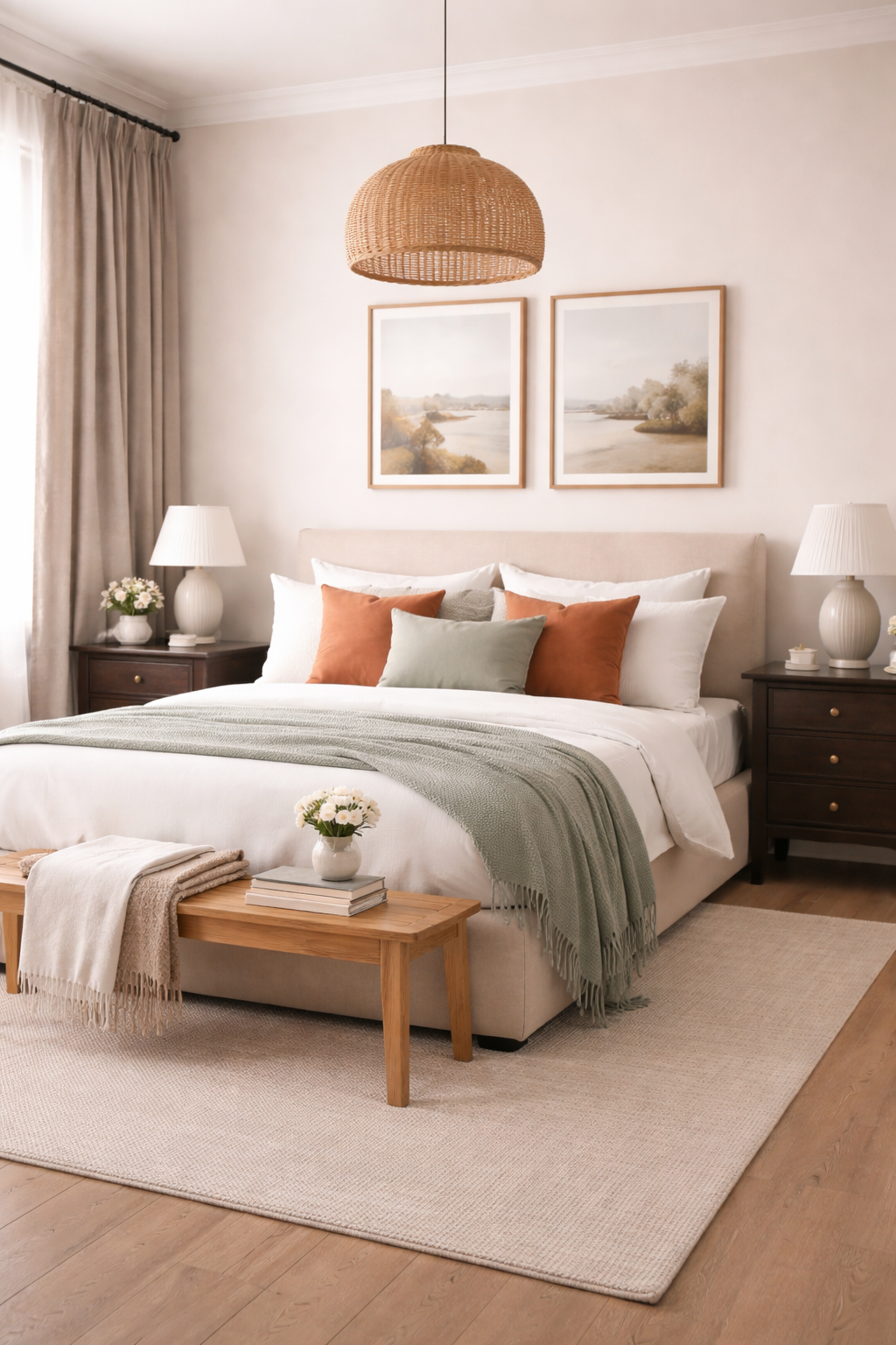
    Soft color, delicate patterns, and charming details define this thoughtfully curated desk edit. Rooted in a cottage-inspired aesthetic with a playful modern edge, this collection blends sweetness with structure—creating a workspace that feels both inspiring and beautifully composed.

    A soft collage arrangement featuring plaid notebooks, floral journals, pink stationery accents, jade skincare tools, and pastel tech accessories

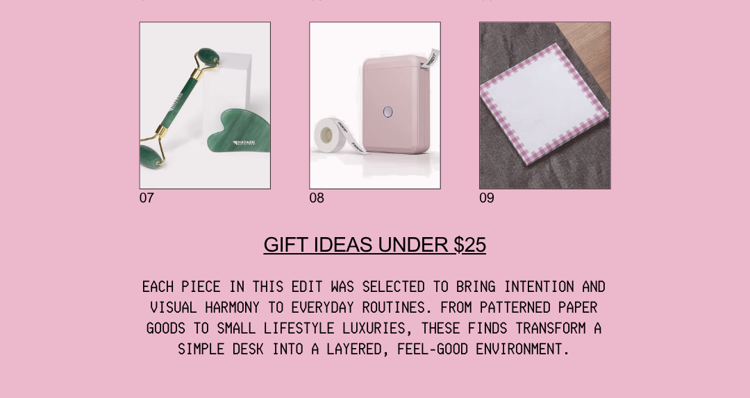
    Each piece in this edit was selected to bring intention and visual harmony to everyday routines. From patterned paper goods to small lifestyle luxuries, these finds transform a simple desk into a layered, feel-good environment.

    1. Yellow Buffalo Plaid Spiral Notebook | Floppy Fox Designs

    Yellow Buffalo Plaid Spiral Notebook introduces a warm, nostalgic pattern that instantly softens the workspace. The cheerful plaid design brings a cozy familiarity while still feeling fresh and elevated, making it ideal for daily notes or journaling rituals. Its presence adds structure while maintaining a relaxed, inviting tone.

    Why we love it!
    • Classic pattern reimagined in a bright, uplifting palette
    • Adds warmth and visual texture to the desk
    • Perfect for both functional writing and aesthetic layering

    >> Get it Here!!! <<


    2. Strawberry Floral Hardcover Journal | Floppy Fox Designs

    A hardcover journal with strawberry and floral motifs in soft pastel tones designed for a feminine cottage-inspired workspace.

    Strawberry Floral Hardcover Journal captures a delicate cottagecore charm with its soft florals and subtle fruit motifs. The hardcover design feels timeless and substantial, creating a special place for reflections, plans, or creative thoughts. It brings a gentle romance that elevates the entire desk composition.

    Why we love it!
    • Whimsical print with a refined, feminine feel
    • Durable structure for everyday use
    • Enhances the softness of the overall aesthetic

    >> Get it Here!!! <<


    3. Pink Plaid Sticky Notes | Floppy Fox Designs

    A set of pink plaid bordered sticky notes with a clean layout ideal for stylish desk organization. "IMPORTANT!" written on the note in black ink and underlined. The note is hanging on a stainless fridge with magnets.

    Pink Plaid Sticky Notes deliver a polished yet playful accent to everyday organization. The subtle plaid border frames notes beautifully, turning even quick reminders into part of the décor. Their soft pink tone complements the palette while adding a crisp, preppy touch.

    Why we love it!
    • Functional notes that double as design details
    • Balanced mix of minimal and decorative
    • Perfect for layering across planners and notebooks

    >> Get it Here!!! <<


    4. Garden Party Gel Pen Set (2ct) | Rifle Paper Co.

    A floral-designed gel pen set with smooth ink flow and elegant botanical detailing for refined writing.

    Garden Party Gel Pen Set (2ct) introduces refined botanical detailing through elegant writing tools. Smooth ink flow paired with delicate floral design transforms simple writing into a more elevated experience. These pens add a polished finishing layer to the desk.

    Why we love it!
    • Beautifully detailed design with a luxury feel
    • Enhances everyday writing moments
    • Complements floral and cottage-inspired themes

    >> Get it Here!!! <<


    5. The Animal Icon Photo Holder: Dog Edition | Urban Outfitters

    A sculptural dog-shaped photo holder in a golden finish used to display notes or small prints on a desk.

    The Animal Icon Photo Holder: Dog Edition adds a playful, personality-driven element to the setup. Its sculptural form doubles as décor, while holding photos or notes in a charming, lighthearted way. It introduces dimension and a sense of individuality.

    Why we love it!
    • Combines function with sculptural interest
    • Adds a personal, expressive touch
    • Creates visual height variation on the desk

    >> Get it Here!!! <<


    6. Icon Straws, Set of 2 | Bee & Ladybug | Urban Outfitters

    Decorative reusable straws featuring small bee and ladybug accents adding playful charm to drinkware.

    Icon Straws, Set of 2 | Bee & Ladybug bring a subtle, whimsical detail to daily routines. The tiny decorative accents elevate even a simple drink, reinforcing the playful nature of the overall edit. These pieces add charm without overwhelming the aesthetic.

    Why we love it!
    • Small detail with high visual impact
    • Reinforces the cottage-inspired theme
    • Makes everyday moments feel curated

    >> Get it Here!!! <<


    7. DetoxifEYE Hydrating & Depuffing Eye Patches | Pixi

    Green hydrogel eye patches designed for hydration and depuffing placed in a calming self-care setting.

    DetoxifEYE Hydrating & Depuffing Eye Patches introduce a self-care element that complements the serene desk atmosphere. Designed to refresh and hydrate, they encourage intentional pauses throughout the day. Their soft green hue subtly aligns with the natural palette.

    Why we love it!
    • Blends beauty and wellness seamlessly
    • Encourages mindful breaks
    • Enhances the calm, restorative mood

    >> Get it Here!!! <<


    8. Gua Sha & Face Roller Set | Havasu Nutrition

    Jade facial tools including a gua sha and roller used for skincare rituals and displayed on a serene vanity surface.

    Gua Sha & Face Roller Set adds a ritualistic, spa-like quality to the space. The smooth jade tools offer both visual tranquility and functional skincare benefits, reinforcing a sense of calm and care. It grounds the desk in a more holistic lifestyle approach.

    Why we love it!
    • Introduces a wellness-focused element
    • Adds natural material contrast
    • Elevates the everyday routine into a ritual

    >> Get it Here!!! <<


    9. D110 Mini Bluetooth Thermal Sticker Printer | Jaden

    D110 Mini Bluetooth Thermal Sticker Printer delivers a modern, functional contrast to the soft aesthetic. Its compact design and soft pink finish integrate seamlessly while offering practical organization for labels, notes, and creative projects. It bridges creativity with efficiency.

    Why we love it!
    • Compact and visually cohesive design
    • Enhances organization with style
    • Perfect blend of tech and aesthetic

    >> Get it Here!!! <<


    This desk edit captures the beauty of thoughtful layering—where soft patterns, delicate details, and purposeful tools come together effortlessly. Each piece contributes to a cohesive environment that feels calm, inspiring, and quietly refined, encouraging a slower, more intentional approach to everyday tasks.

  • How to Choose a Bedroom Color Palette

    How to Choose a Bedroom Color Palette

    A well-designed bedroom begins with a palette that feels intentional, layered, and quietly cohesive. The most inviting spaces are never built on a single color alone, instead they unfold through a thoughtful composition of tones that balance softness, contrast, and warmth. A five-color palette offers the ideal structure: one main color to anchor the room, two supporting tones to build depth, a refined accent for visual interest, and a grounding natural material to bring everything into harmony.

    This approach transforms color from a simple choice into a curated experience; one that feels both elevated and deeply personal.

    Creating a palette in this way allows every element in the room to feel connected. From walls and textiles to furniture and finishes, each color plays a distinct role, ensuring the space feels layered rather than overwhelming. The result is a bedroom that feels calm, complete, and visually considered.


    Main Color | The Foundation Hue

    A serene bedroom featuring a five-color palette with soft neutral walls, layered textiles in complementary tones, a subtle accent hue, and warm natural wood furniture creating a cohesive and calming space.

    The main color sets the emotional tone of the bedroom. It typically covers the largest surface area like walls, large upholstery pieces, or bedding and acts as the visual anchor for the entire palette.

    A successful main color is neither too bold nor too flat. Soft neutrals such as warm ivory, muted sage, or dusty blue create a restful foundation, while deeper tones like charcoal or mocha can introduce a cocooning effect when balanced correctly. The key is choosing a shade that feels expansive yet grounded, allowing the other colors to layer seamlessly on top.

    Why we love it!

    • Establishes the overall mood and atmosphere of the space
    • Provides a cohesive backdrop for layering additional tones
    • Creates visual calm when used across large surfaces

    Supporting Color One | The Soft Contrast

    Neutral upholstered bed in a soft warm beige fabric acting as the main color foundation within a calming bedroom setting.

    The first supporting color should gently contrast the main hue while maintaining harmony. This tone often appears in secondary textiles and helps prevent the palette from feeling one-dimensional.

    If the main color is cool, this supporting tone can introduce subtle warmth, and vice versa. For example, pairing a soft gray main color with a warm taupe supporting tone creates a nuanced interplay that feels effortless rather than stark.

    Why we love it!

    • Adds dimension without disrupting the overall calm
    • Bridges tonal gaps between other palette elements
    • Enhances visual interest in soft, understated ways

    Supporting Color Two | The Depth Builder

    Linen curtains in a muted taupe tone adding soft contrast and texture to a light-filled bedroom.

    The second supporting color introduces depth and structure. This is often a slightly richer or darker tone that grounds the lighter hues in the room. It can appear in furniture finishes, layered bedding, or larger décor pieces.

    This color should feel like a natural extension of the palette and never competing, but quietly reinforcing it. For example, a palette built around soft beige and cream might incorporate a deep caramel or espresso tone to anchor the space.

    Why we love it!

    • Grounds the palette with subtle richness
    • Prevents the room from feeling overly light or washed out
    • Adds visual weight in a refined, balanced way

    Accent Color | The Statement Detail

    Dark wood nightstand in a rich espresso finish introducing depth and grounding to a neutral bedroom palette.

    The accent color is where personality enters the space. Used sparingly, this tone draws the eye and creates moments of visual intrigue. It may appear in decorative pillows, artwork, or a single statement piece.

    The most effective accent colors are slightly unexpected yet still connected to the palette. A muted terracotta in a neutral room or a deep navy in a soft tonal scheme can elevate the entire design without overwhelming it.

    Restraint is essential and this color should feel intentional, not dominant.

    Why we love it!

    • Introduces contrast and visual energy
    • Highlights key design moments within the room
    • Allows for seasonal or stylistic updates with minimal effort

    Natural Material Shade | The Organic Anchor

    Decorative throw pillows in a muted terracotta accent tone adding warmth and visual interest to layered bedding.

    No bedroom palette feels complete without the warmth of a natural material. Whether it’s wood, stone, linen, or metal, this element adds texture and authenticity that color alone cannot achieve.

    A light oak finish brings softness and airiness, while darker walnut introduces depth and sophistication. Brushed brass or matte black metal can serve as subtle yet impactful additions, tying the palette together through texture and tone.

    This layer is what makes the room feel lived-in, grounded, and timeless.

    Why we love it!

    • Adds tactile warmth and organic texture
    • Grounds the palette in natural, enduring materials
    • Enhances the overall sense of balance and cohesion

    Bringing the Palette Together

    Light oak bench with natural grain texture bringing organic warmth and balance to the bedroom design.

    The beauty of a five-color palette lies in its balance. Each color serves a purpose, and when layered thoughtfully, they create a space that feels both curated and effortless.

    Start with the main color and build outward, ensuring each additional tone complements rather than competes. Distribute colors evenly throughout the room, echoing them in textiles, finishes, and small details so the palette feels cohesive from every angle.

    The final result is a bedroom that feels serene yet layered, refined yet inviting. A space where every element belongs, and nothing feels out of place.

    When approached with intention, color becomes more than a design choice; it becomes the quiet foundation of a beautifully composed room.


    Frequently Asked Questions

    How do I choose the right main color for my bedroom?
    Start by considering the mood you want to create. Softer tones like warm neutrals, muted greens, or dusty blues tend to feel calming and expansive, while deeper shades like charcoal or mocha create a more intimate, cocooning effect. The main color should feel comfortable across large surfaces and support the overall atmosphere of the room.


    Can I use more than five colors in a bedroom palette?
    You can, but restraint is what creates cohesion. A five-color structure provides enough variation to feel layered without becoming overwhelming. If additional tones are introduced, they should closely relate to the existing palette rather than competing with it.


    What if my room already has furniture in a different color?
    Work with what you have by treating existing pieces as part of your palette. Identify their undertones and build around them using complementary shades. A cohesive room doesn’t require starting from scratch—it requires thoughtful integration.


    How do I keep my palette from feeling flat or boring?
    Focus on contrast through tone and texture rather than adding more colors. Pair lighter and darker shades within the same palette and layer materials like wood, linen, or metal to create depth and visual interest.


    How often should each color appear in the room?
    Repetition is key to cohesion. Each color should appear at least two to three times throughout the space, whether through textiles, furniture, or small accents. This creates a sense of balance and prevents any single element from feeling out of place.


    Can accent colors be changed seasonally?
    Yes! This is one of the most flexible elements of the palette. Because accent colors are used sparingly, they can be easily swapped through pillows, throws, or decorative objects to refresh the space without redesigning the entire room.


    What if I prefer a more minimal look?
    A five-color palette can still feel minimal when the tones are closely related. Choose shades within the same color family and rely on subtle contrast and texture to create variation while maintaining a clean, understated aesthetic.