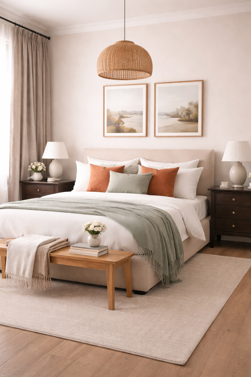
A well-designed bedroom begins with a palette that feels intentional, layered, and quietly cohesive. The most inviting spaces are never built on a single color alone, instead they unfold through a thoughtful composition of tones that balance softness, contrast, and warmth. A five-color palette offers the ideal structure: one main color to anchor the room, two supporting tones to build depth, a refined accent for visual interest, and a grounding natural material to bring everything into harmony.
This approach transforms color from a simple choice into a curated experience; one that feels both elevated and deeply personal.
Creating a palette in this way allows every element in the room to feel connected. From walls and textiles to furniture and finishes, each color plays a distinct role, ensuring the space feels layered rather than overwhelming. The result is a bedroom that feels calm, complete, and visually considered.
Main Color | The Foundation Hue

The main color sets the emotional tone of the bedroom. It typically covers the largest surface area like walls, large upholstery pieces, or bedding and acts as the visual anchor for the entire palette.
A successful main color is neither too bold nor too flat. Soft neutrals such as warm ivory, muted sage, or dusty blue create a restful foundation, while deeper tones like charcoal or mocha can introduce a cocooning effect when balanced correctly. The key is choosing a shade that feels expansive yet grounded, allowing the other colors to layer seamlessly on top.
Why we love it!
- Establishes the overall mood and atmosphere of the space
- Provides a cohesive backdrop for layering additional tones
- Creates visual calm when used across large surfaces
Supporting Color One | The Soft Contrast

The first supporting color should gently contrast the main hue while maintaining harmony. This tone often appears in secondary textiles and helps prevent the palette from feeling one-dimensional.
If the main color is cool, this supporting tone can introduce subtle warmth, and vice versa. For example, pairing a soft gray main color with a warm taupe supporting tone creates a nuanced interplay that feels effortless rather than stark.
Why we love it!
- Adds dimension without disrupting the overall calm
- Bridges tonal gaps between other palette elements
- Enhances visual interest in soft, understated ways
Supporting Color Two | The Depth Builder

The second supporting color introduces depth and structure. This is often a slightly richer or darker tone that grounds the lighter hues in the room. It can appear in furniture finishes, layered bedding, or larger décor pieces.
This color should feel like a natural extension of the palette and never competing, but quietly reinforcing it. For example, a palette built around soft beige and cream might incorporate a deep caramel or espresso tone to anchor the space.
Why we love it!
- Grounds the palette with subtle richness
- Prevents the room from feeling overly light or washed out
- Adds visual weight in a refined, balanced way
Accent Color | The Statement Detail

The accent color is where personality enters the space. Used sparingly, this tone draws the eye and creates moments of visual intrigue. It may appear in decorative pillows, artwork, or a single statement piece.
The most effective accent colors are slightly unexpected yet still connected to the palette. A muted terracotta in a neutral room or a deep navy in a soft tonal scheme can elevate the entire design without overwhelming it.
Restraint is essential and this color should feel intentional, not dominant.
Why we love it!
- Introduces contrast and visual energy
- Highlights key design moments within the room
- Allows for seasonal or stylistic updates with minimal effort
Natural Material Shade | The Organic Anchor

No bedroom palette feels complete without the warmth of a natural material. Whether it’s wood, stone, linen, or metal, this element adds texture and authenticity that color alone cannot achieve.
A light oak finish brings softness and airiness, while darker walnut introduces depth and sophistication. Brushed brass or matte black metal can serve as subtle yet impactful additions, tying the palette together through texture and tone.
This layer is what makes the room feel lived-in, grounded, and timeless.
Why we love it!
- Adds tactile warmth and organic texture
- Grounds the palette in natural, enduring materials
- Enhances the overall sense of balance and cohesion
Bringing the Palette Together

The beauty of a five-color palette lies in its balance. Each color serves a purpose, and when layered thoughtfully, they create a space that feels both curated and effortless.
Start with the main color and build outward, ensuring each additional tone complements rather than competes. Distribute colors evenly throughout the room, echoing them in textiles, finishes, and small details so the palette feels cohesive from every angle.
The final result is a bedroom that feels serene yet layered, refined yet inviting. A space where every element belongs, and nothing feels out of place.
When approached with intention, color becomes more than a design choice; it becomes the quiet foundation of a beautifully composed room.
Frequently Asked Questions
How do I choose the right main color for my bedroom?
Start by considering the mood you want to create. Softer tones like warm neutrals, muted greens, or dusty blues tend to feel calming and expansive, while deeper shades like charcoal or mocha create a more intimate, cocooning effect. The main color should feel comfortable across large surfaces and support the overall atmosphere of the room.
Can I use more than five colors in a bedroom palette?
You can, but restraint is what creates cohesion. A five-color structure provides enough variation to feel layered without becoming overwhelming. If additional tones are introduced, they should closely relate to the existing palette rather than competing with it.
What if my room already has furniture in a different color?
Work with what you have by treating existing pieces as part of your palette. Identify their undertones and build around them using complementary shades. A cohesive room doesn’t require starting from scratch—it requires thoughtful integration.
How do I keep my palette from feeling flat or boring?
Focus on contrast through tone and texture rather than adding more colors. Pair lighter and darker shades within the same palette and layer materials like wood, linen, or metal to create depth and visual interest.
How often should each color appear in the room?
Repetition is key to cohesion. Each color should appear at least two to three times throughout the space, whether through textiles, furniture, or small accents. This creates a sense of balance and prevents any single element from feeling out of place.
Can accent colors be changed seasonally?
Yes! This is one of the most flexible elements of the palette. Because accent colors are used sparingly, they can be easily swapped through pillows, throws, or decorative objects to refresh the space without redesigning the entire room.
What if I prefer a more minimal look?
A five-color palette can still feel minimal when the tones are closely related. Choose shades within the same color family and rely on subtle contrast and texture to create variation while maintaining a clean, understated aesthetic.
Leave a Reply